The new Learnyst website builder will help you design a multi paged website without any design experience.
In this article, let me give you a quick overview of the various design elements within your website.
Tables can't be imported directly. Please insert an image of your table which can be found here.
Note: Want help with creating your own course website?
Login to this free online course using your admin email and access the course from our teach101 website.
-Aug-24-2023-01-54-27-2099-PM.png)
Alternatively, you can check this complete YouTube playlist after Feb 3rd, 2023.
Intro to Design Elements
Design elements are the content of a web page. Everything you see on a web page comes from one element or another.
They can be container elements like columns or rows that let you create the page structure or content elements like images, text or buttons that let you add content on your website.
How to add elements on your page
In the builder, click on the + icon on the left sidebar to open the design elements panel.
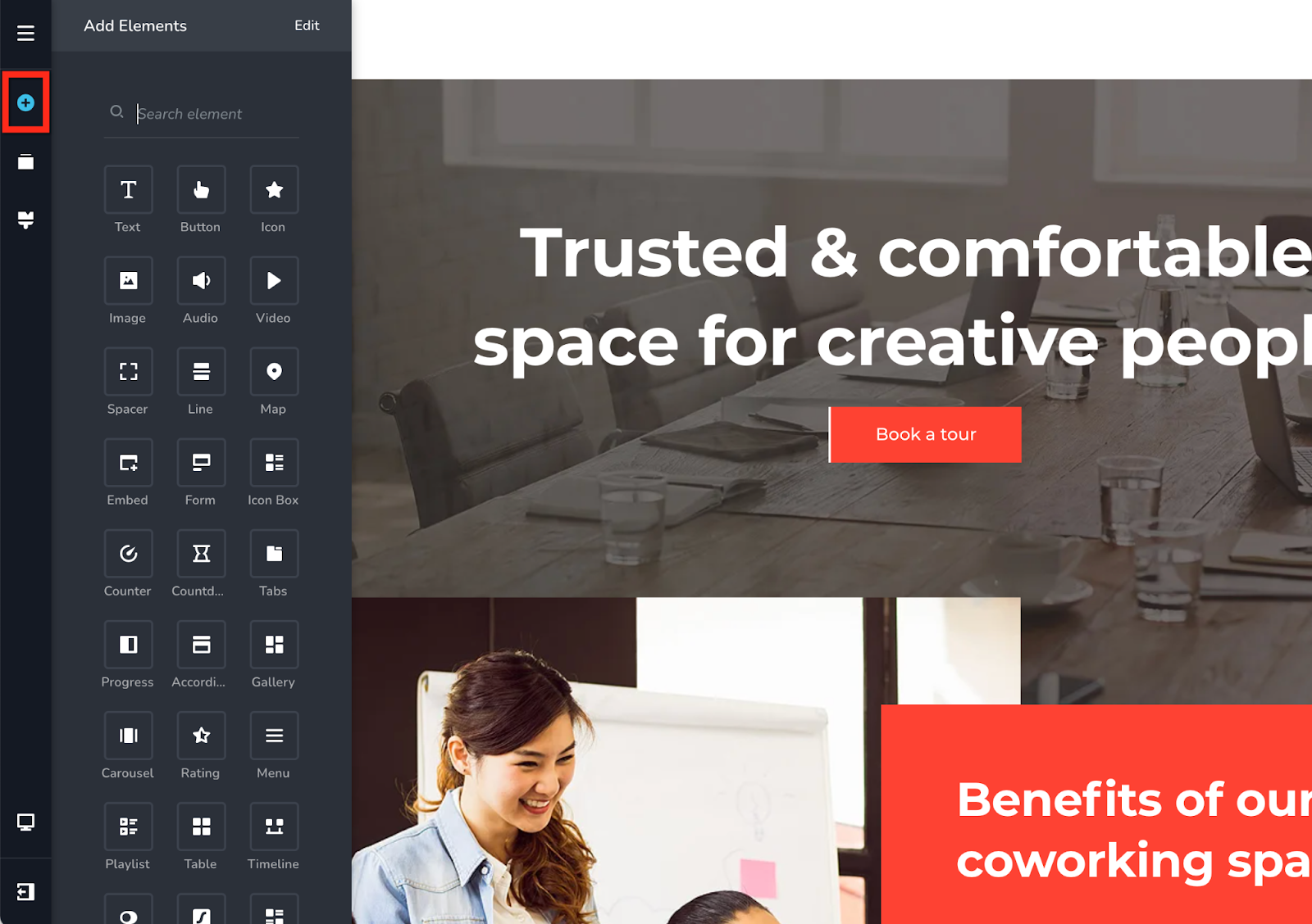
Locate the element you want to add and drag & drop it in the desired location. Guiding lines will appear to show you the options available where you can drop the element.
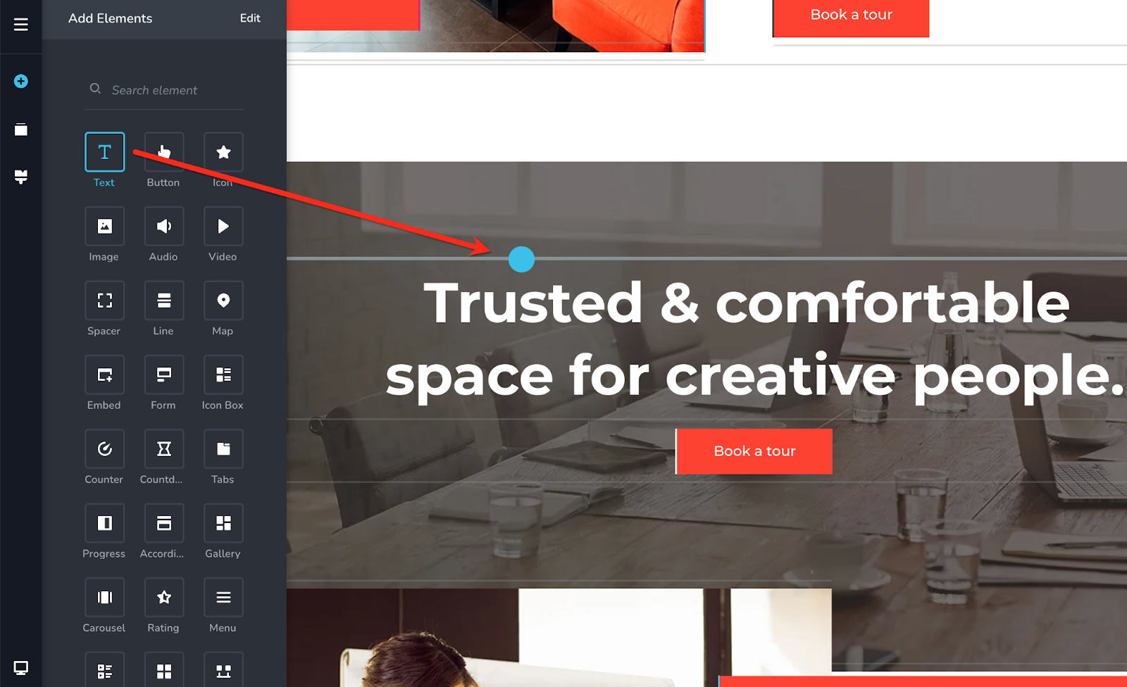
Important: You can't add elements in responsive views. You can add elements only in the Desktop view.
Free vs PRO Elements
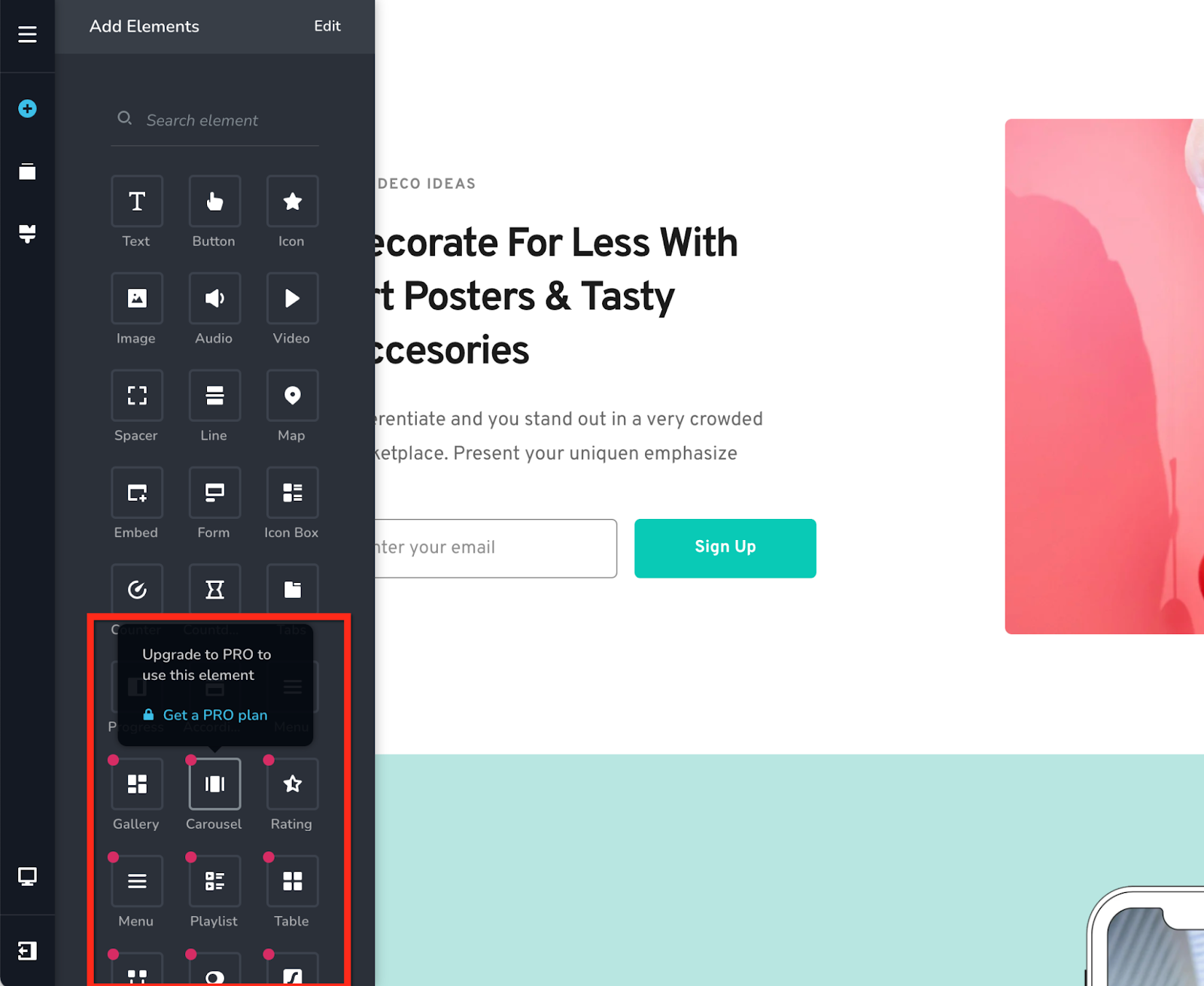
If you are on a PRO plan you'll have access to all the elements in the builder. In a Free plan you'll see red dots on some elements. This means these elements are locked and you'll need a PRO plan to use them.
Some of the PRO elements are: Timeline, Switcher, extended functionality for the Menu element & more.
How to edit elements on your page
Each element comes with a multitude of options that you can change and edit: from colors and fonts, to alignments, sizes, paddings and more. All the elements can be edited by clicking on them and changing the options that appear.
All the options (for all elements) are structured on 3 layers:
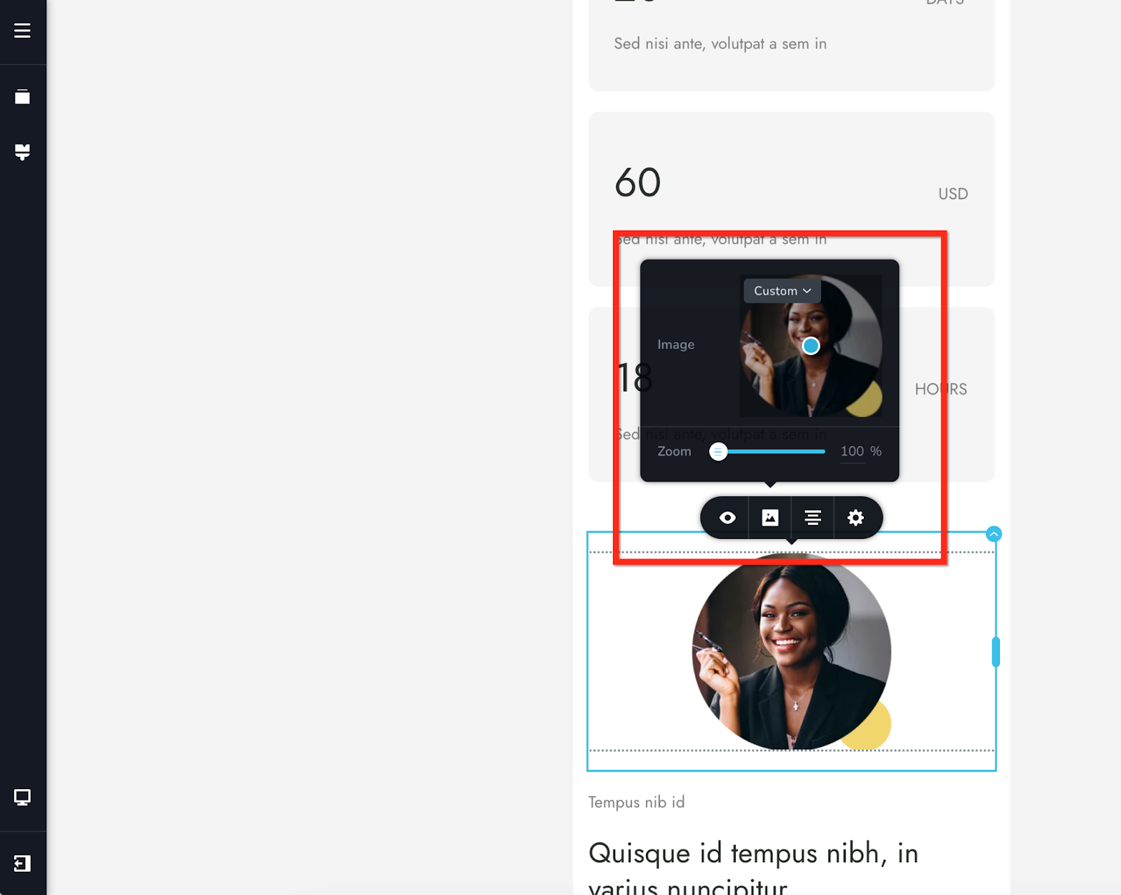
1. The 1st layer is the Toolbar - this appears when you click an element on the page or a corner bubble for container elements and contains categories of options presented as icons.
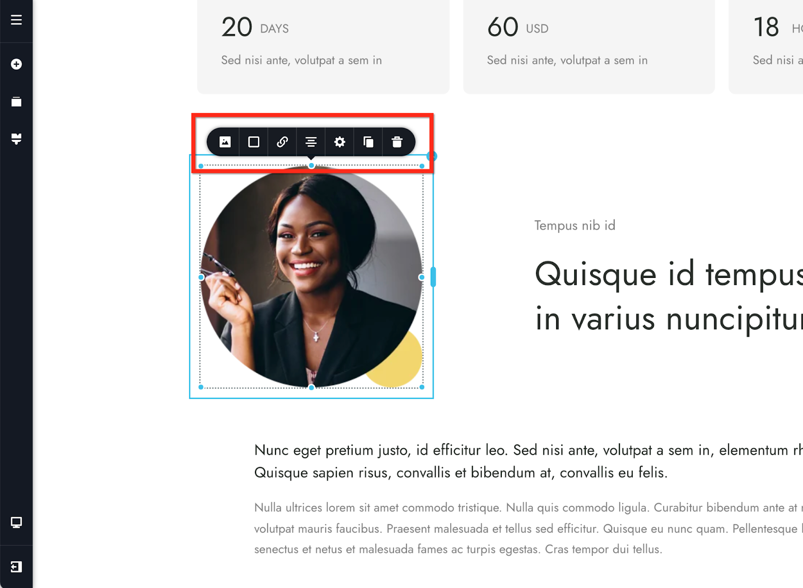
2. The editing Options - this is where the element editing happens, when you click one of the icons on the toolbar.
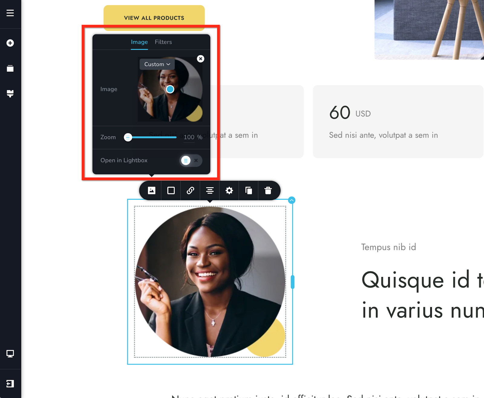
In our example we've used the image element, so on the first icon (that differs from element to element) you'll find options related to the image, upload, filters, zoom, etc.
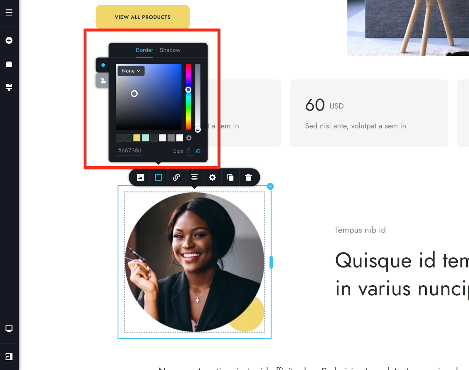
On the second icon you'll find color related options: border, shadow, overlay, etc.
Next are link options, alignment, settings, duplicate and delete.
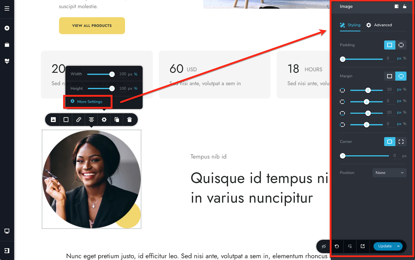
3. The More Settings Options - this is the 3rd and final layer of options that an element can have and you can access it from the gear icon by pressing "More Settings".
This layer contains padding & margin options as well as more advanced options like CSS, custom classes and ID's, Z-index and more.
Important: When you edit elements in the responsive views you'll be able to modify only certain options not all of them. This is by design to help you modify only the options that make sense to be there.
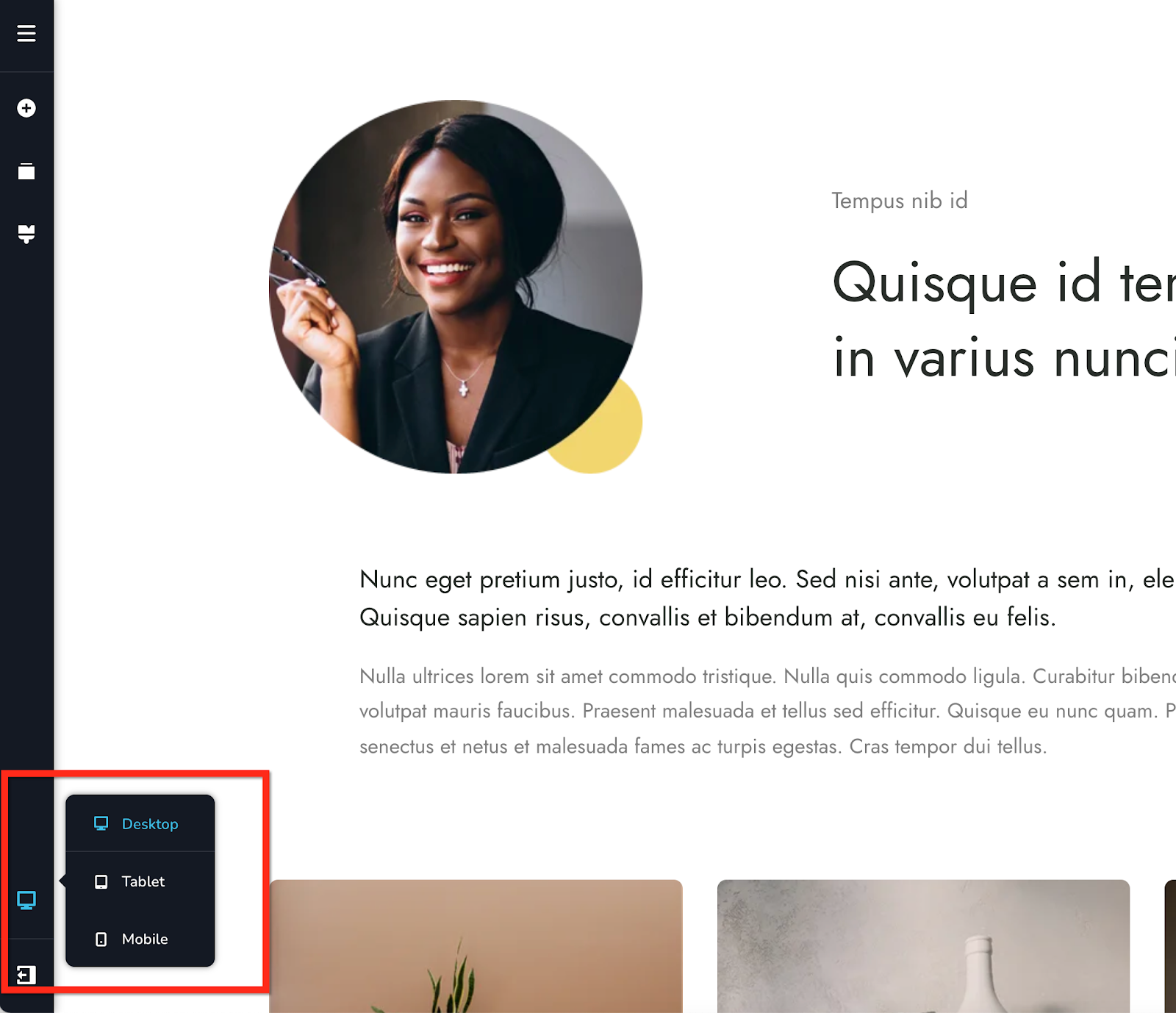
You can access the responsive editing views from the left sidebar:
Important: Except the text content, any modifications done in the responsive views are instanced and will apply only to that view.
Conclusion
So, this sums up all the key features within the website builder. Now, go ahead and create your beautiful website and start marketing your website.
For more tutorials on how to market your website, check out the course marketing tutorials series below.
Did this answer your question? Thanks for the feedback There was a problem submitting your feedback. Please try again later.Yes No No results found
-Jun-10-2024-01-31-39-4468-PM.png?height=120&name=Learnyst%20logo%20(2)-Jun-10-2024-01-31-39-4468-PM.png)